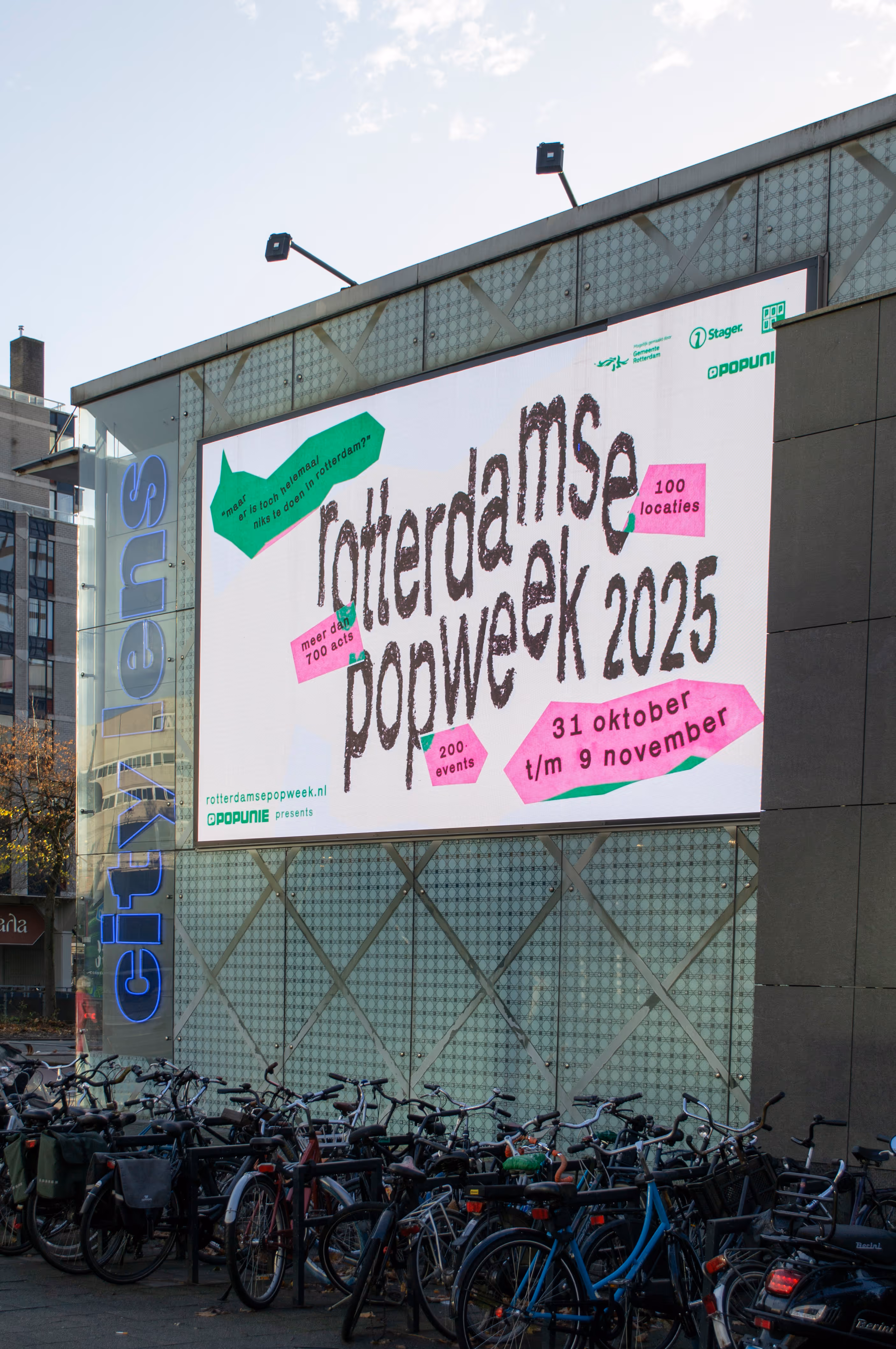
| Rotterdamse Popweek 2025 | Popunie | graphic design | 2025 |
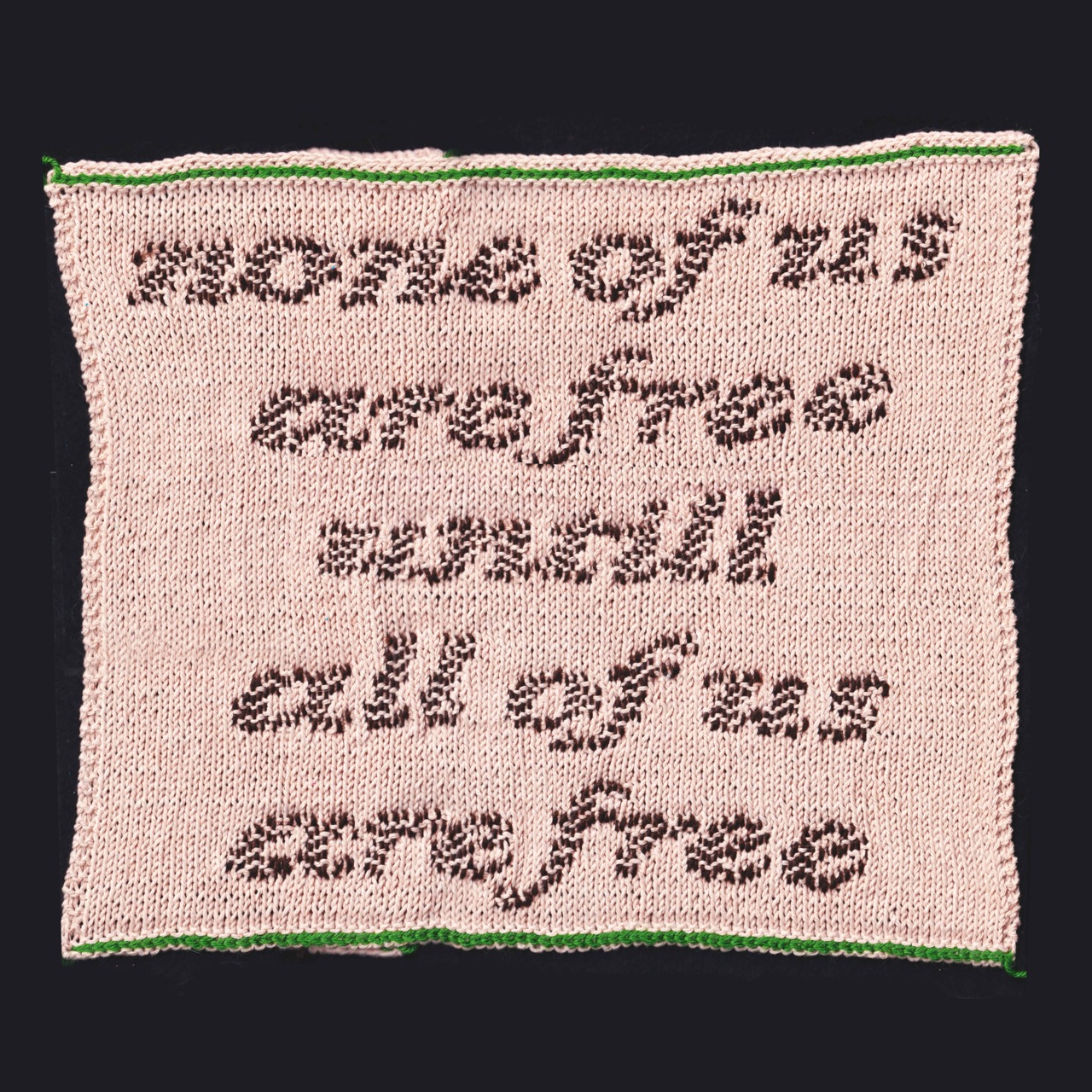
| None of us are free | | graphic design, fiber arts | 2025 |
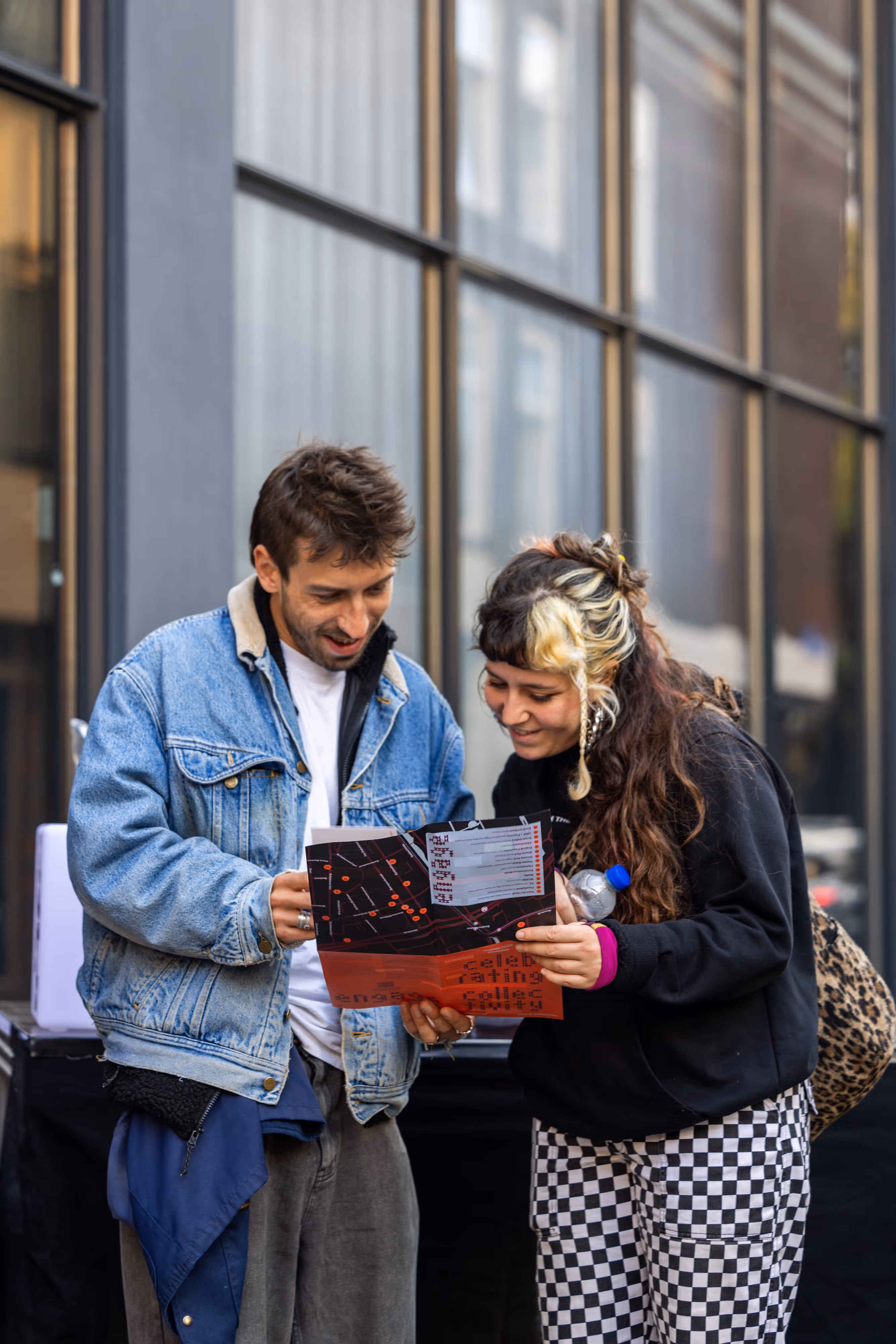
| engage 2025 | engage rotterdam | graphic design, communication | 2025 |
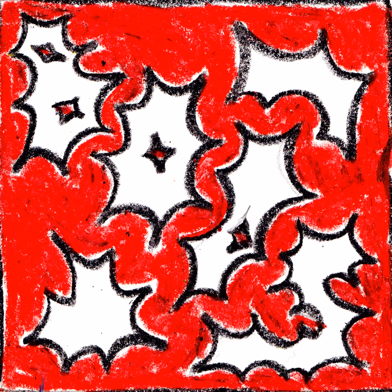
| A Necessary Other | HDK-Valand MFA Fine Arts | identity design, exhibition | 2025 |
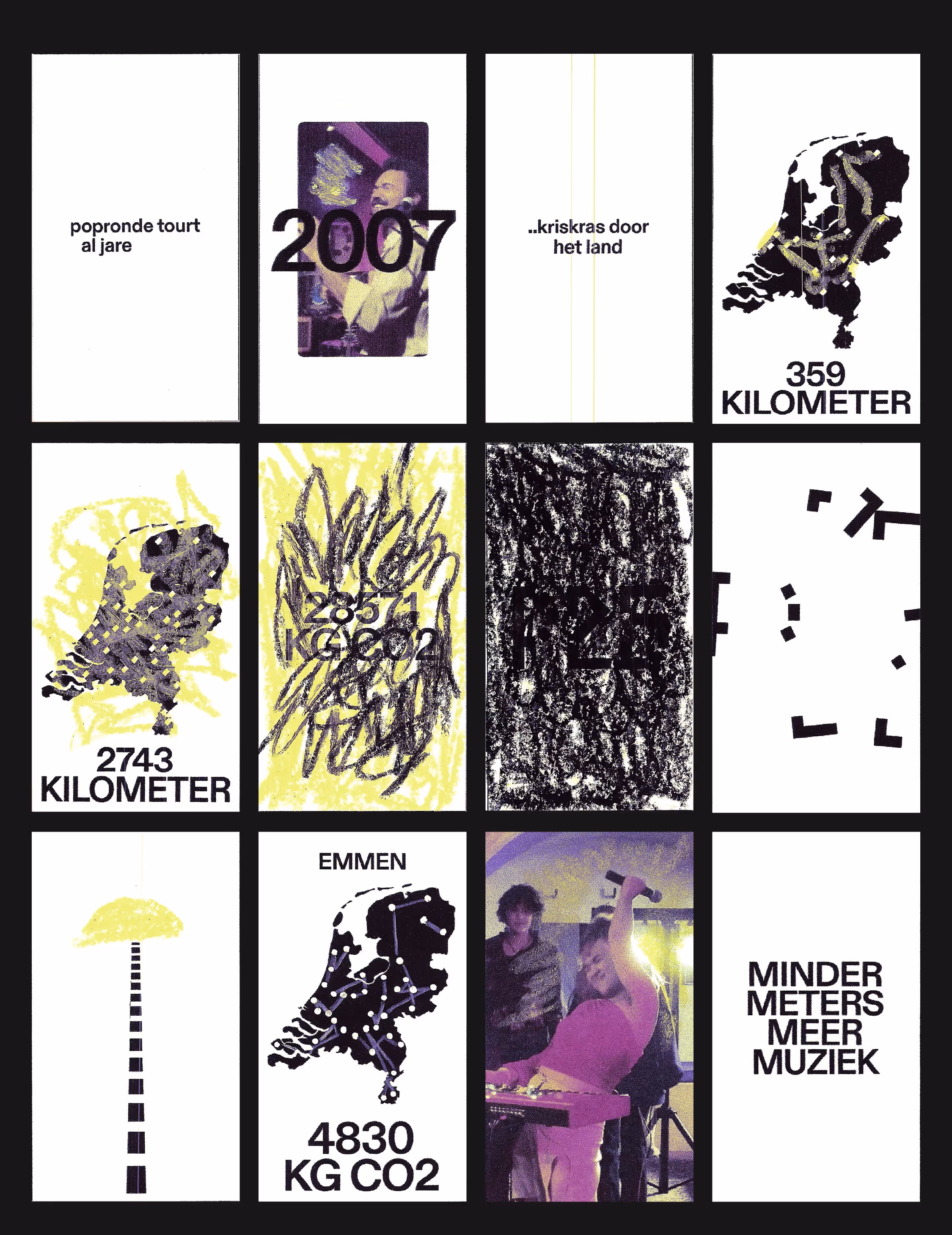
| Minder Uitstoot Meer Popronde | Popronde | animation | 2025 |
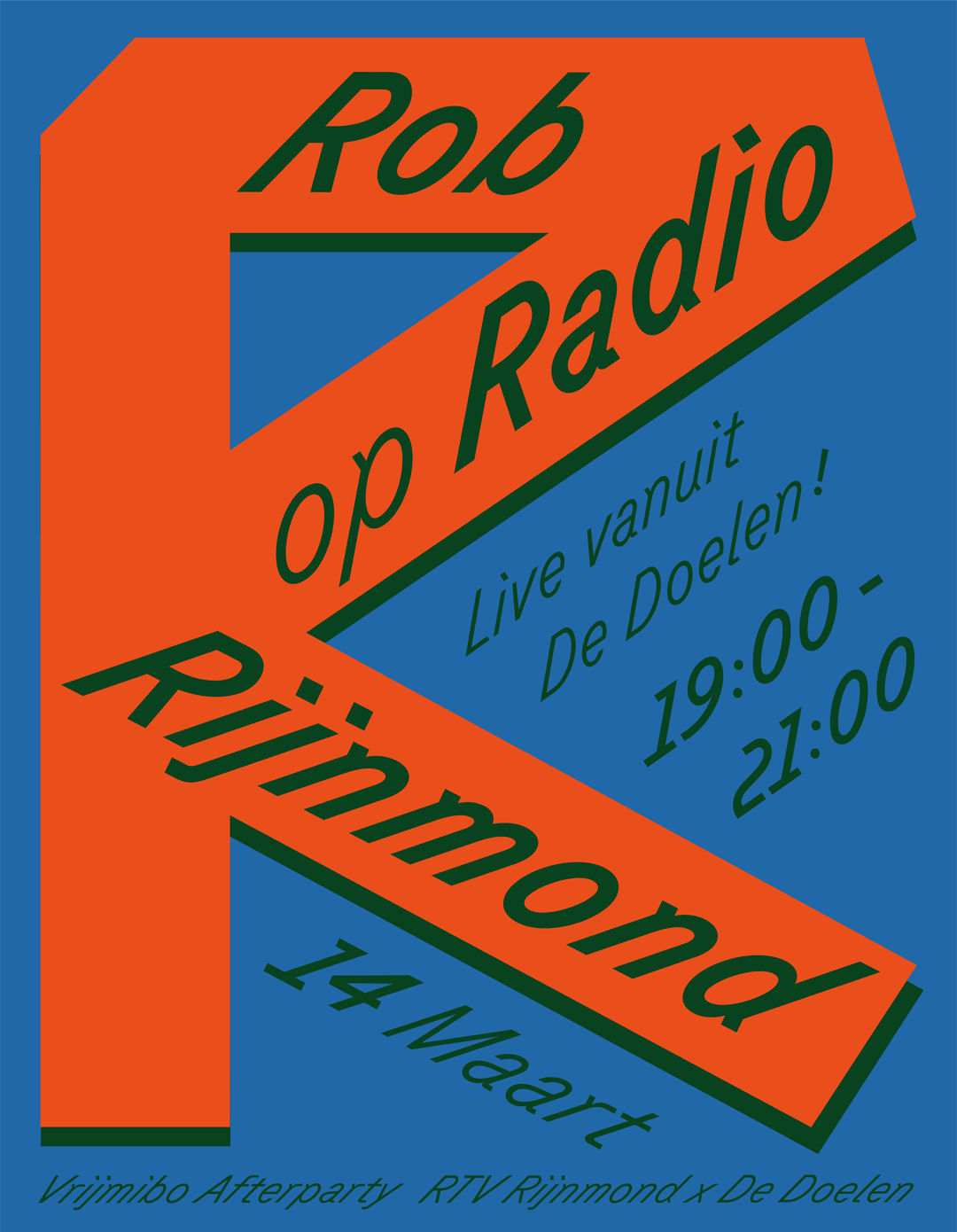
| Rob op Radio Rijnmond | Rob van Groeningen | graphic design | 2025 |
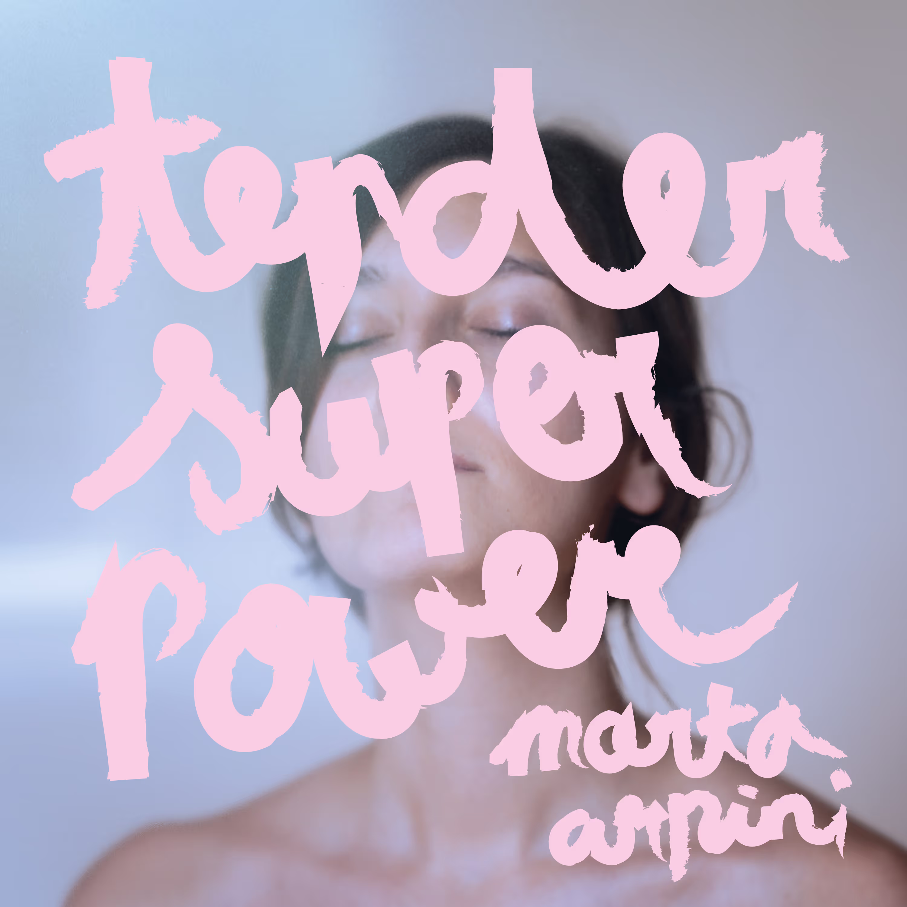
| Tender Superpower | Marta Arpini | graphic design | 2025 |
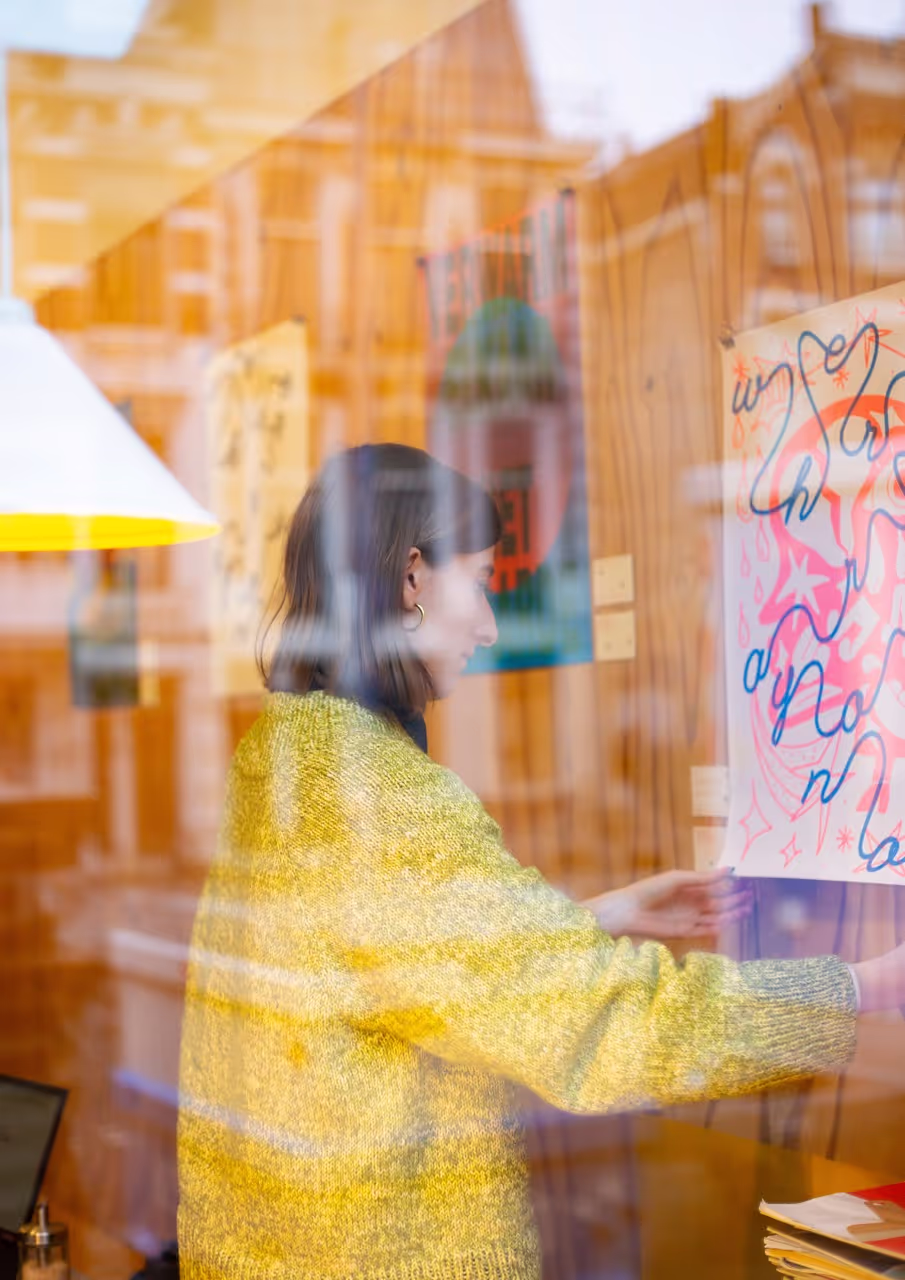
| Poster exhibition @ COPPI | | exhibition | 2025 |
| Mood playlists | | graphic design | 2024 |
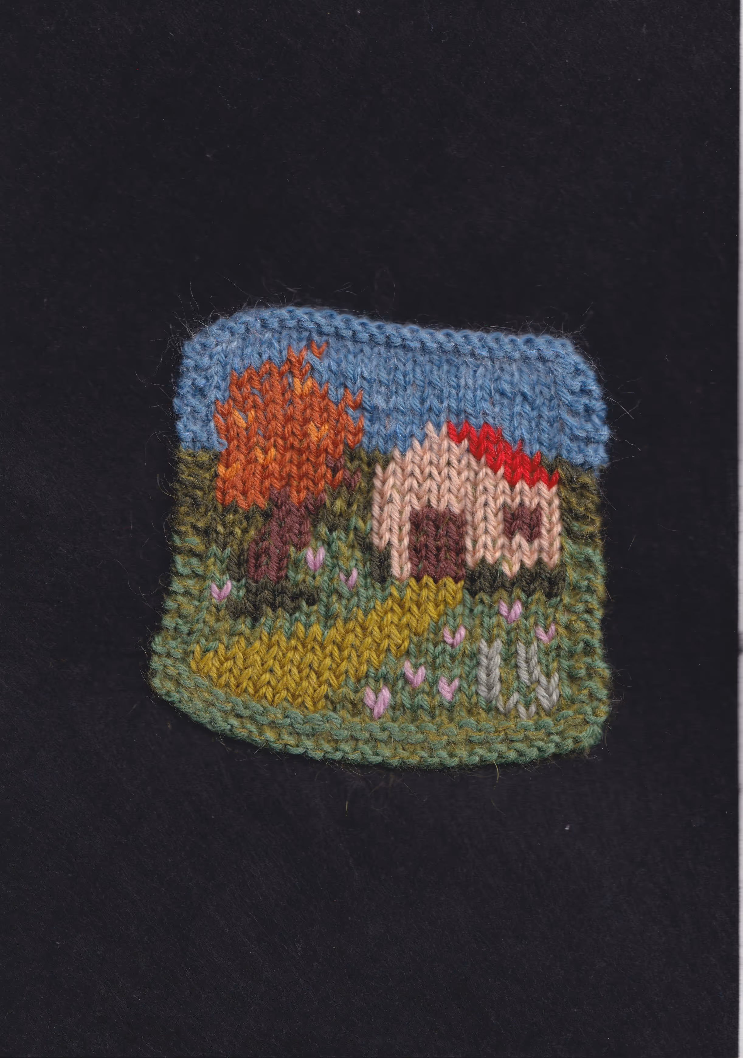
| Niet Lullen Maar Breikamp! | Niet Lullen Maar Breien | graphic design | 2024 |
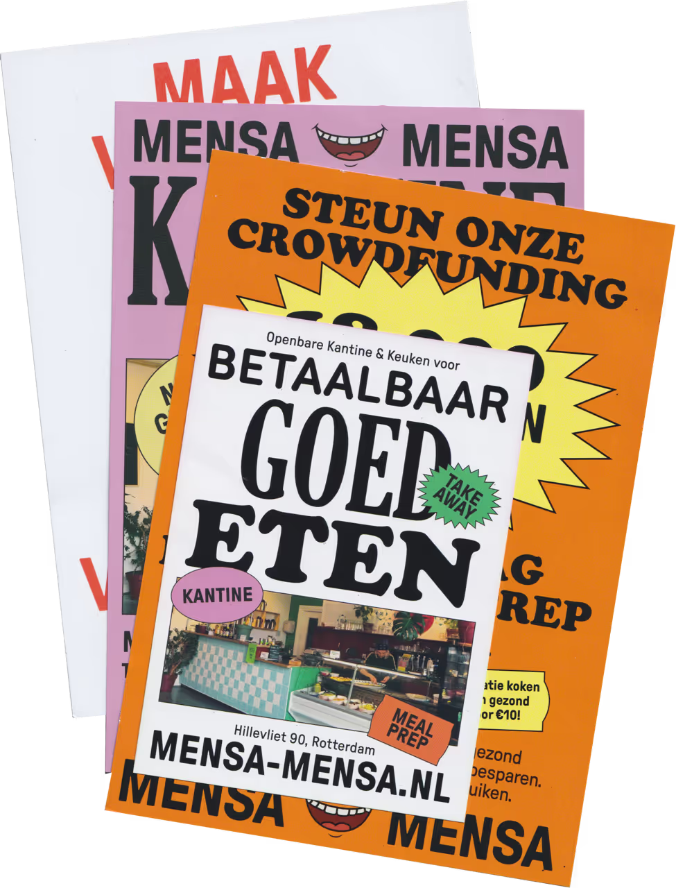
| Mensa Mensa | Public Food | identity design | 2024 |
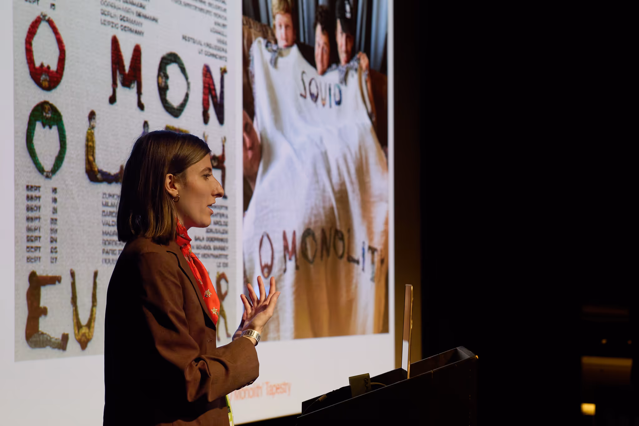
| Een passend plaatje | Muzikantendag | talk | 2024 |
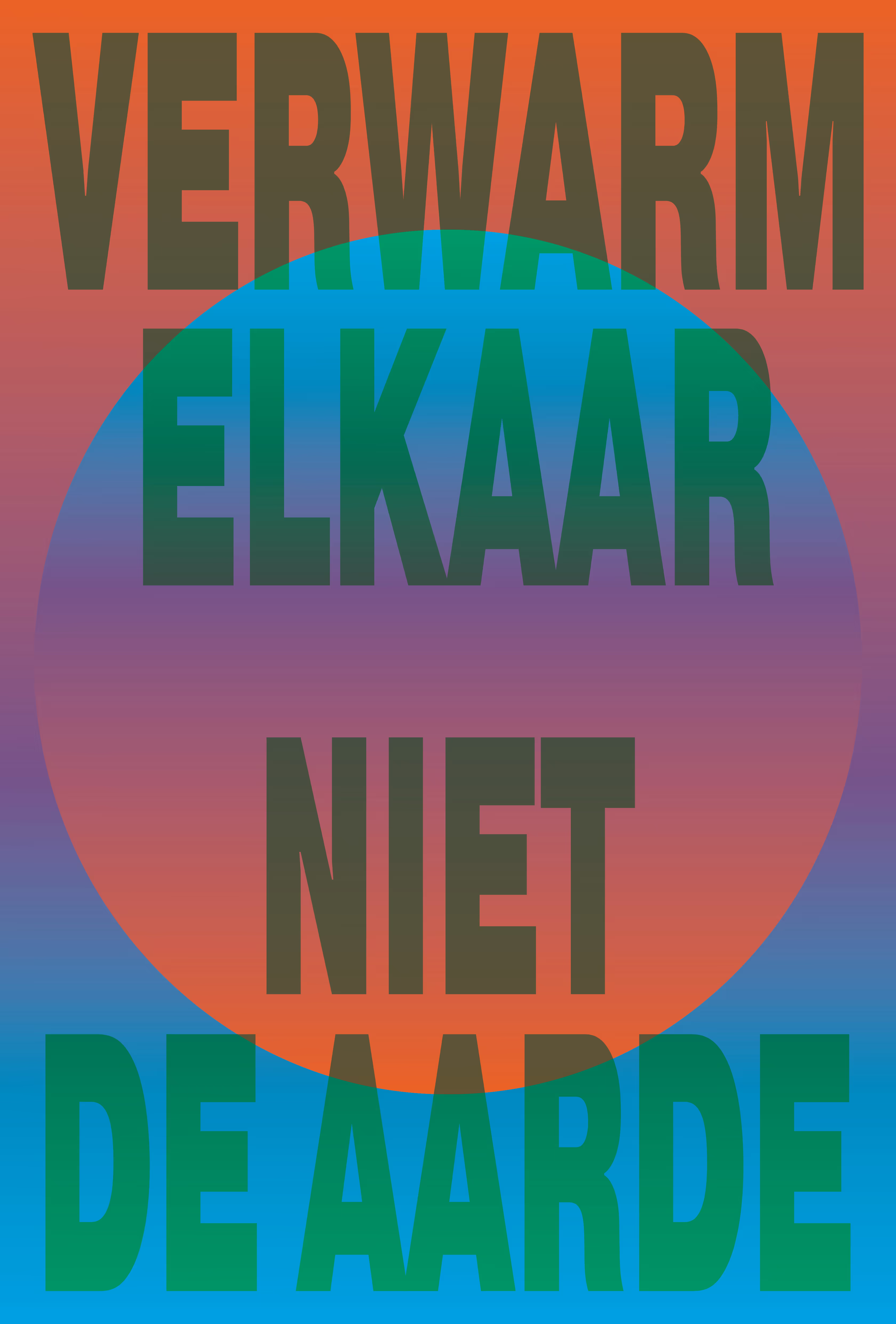
| Verwarm Elkaar | | poster | 2024 |
| Poooodle scarf | Poodle | merch | 2023 |
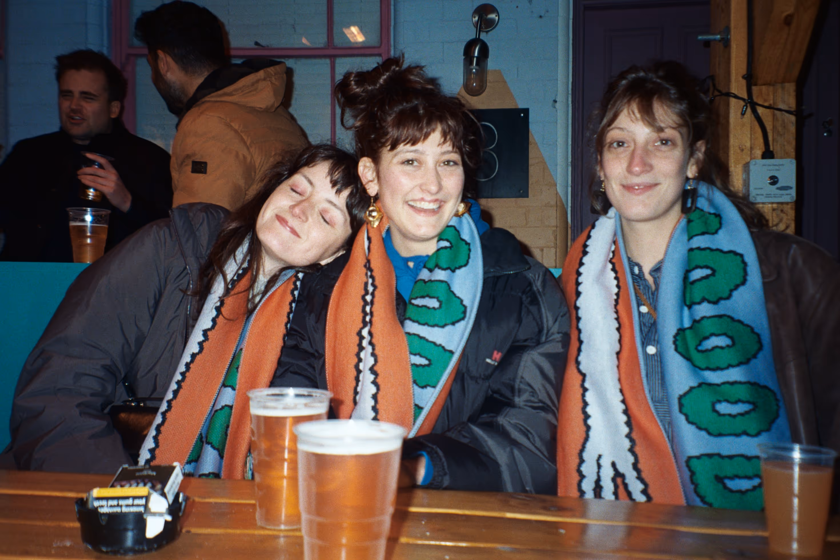
| Popronde scarf | Popronde | merch | 2023 |
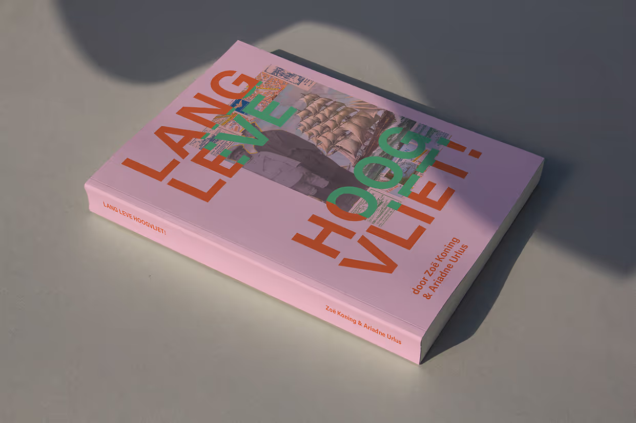
| Lang Leve Hoogvliet! | Zoë Venus Koning | publication design | 2023 |
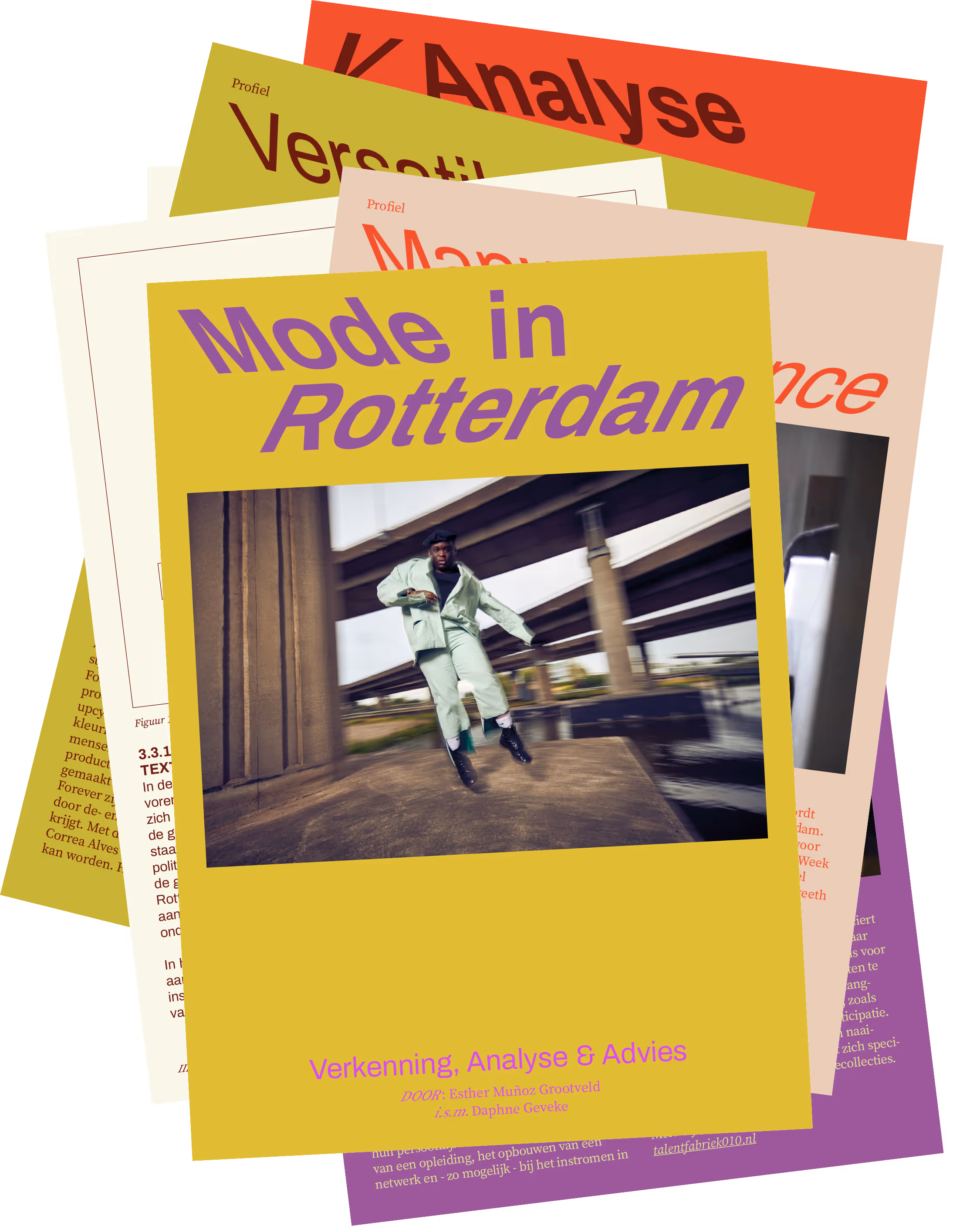
| Mode in Beweging | Esther Muñoz Grootveld | publication design | 2023 |
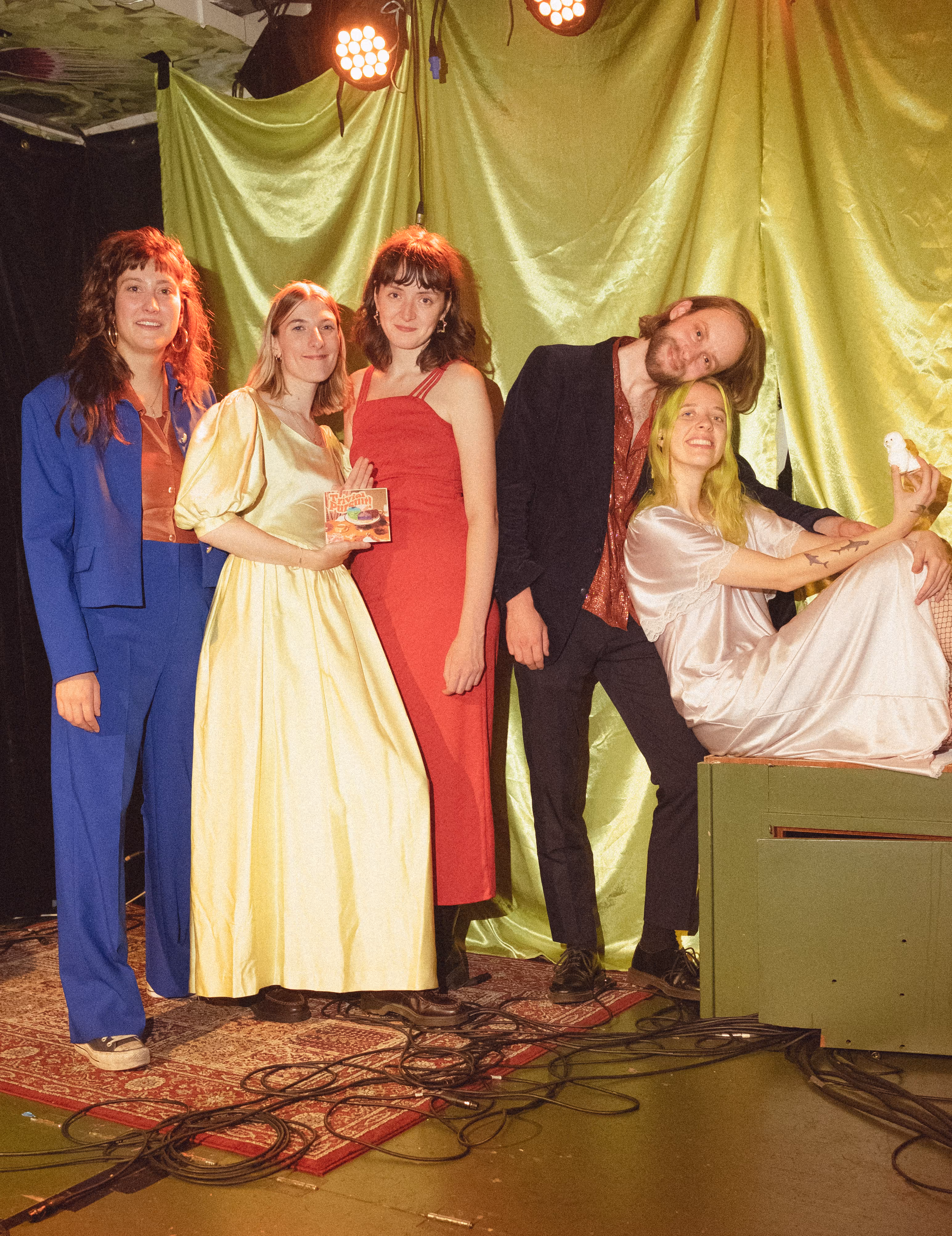
| Trivial Pursuit! | Poodle | art direction, graphic design | 2022 |
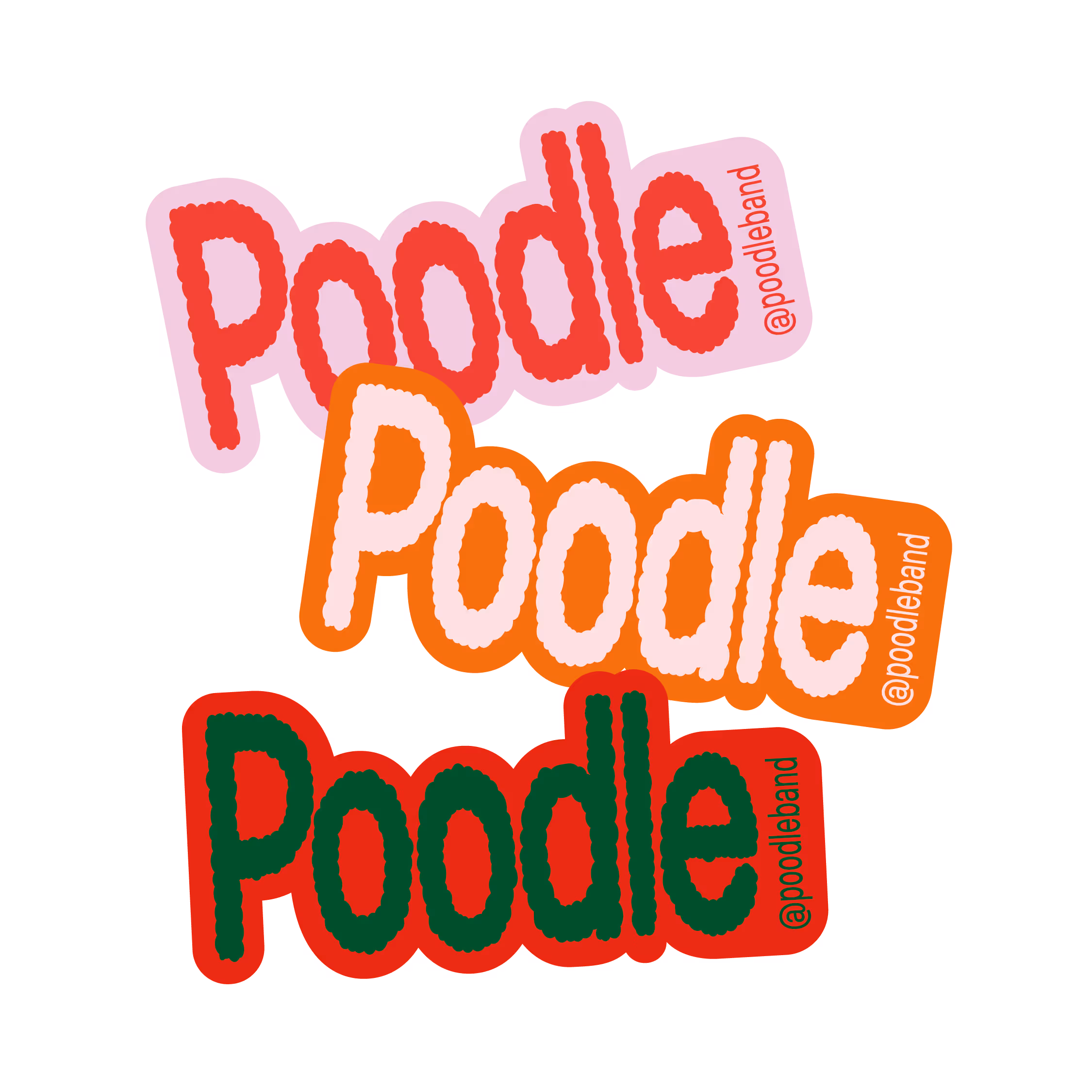
| Poodle | Poodle | art direction, graphic design | 2022 |
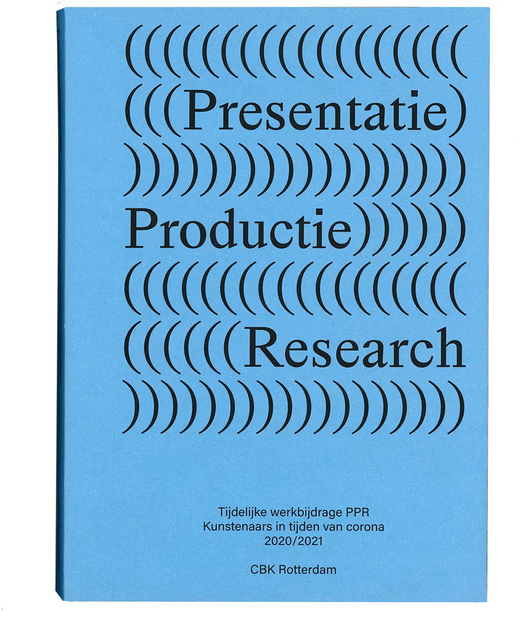
| Presentatie, Productie, Research | CBK Rotterdam | publication design | 2022 |
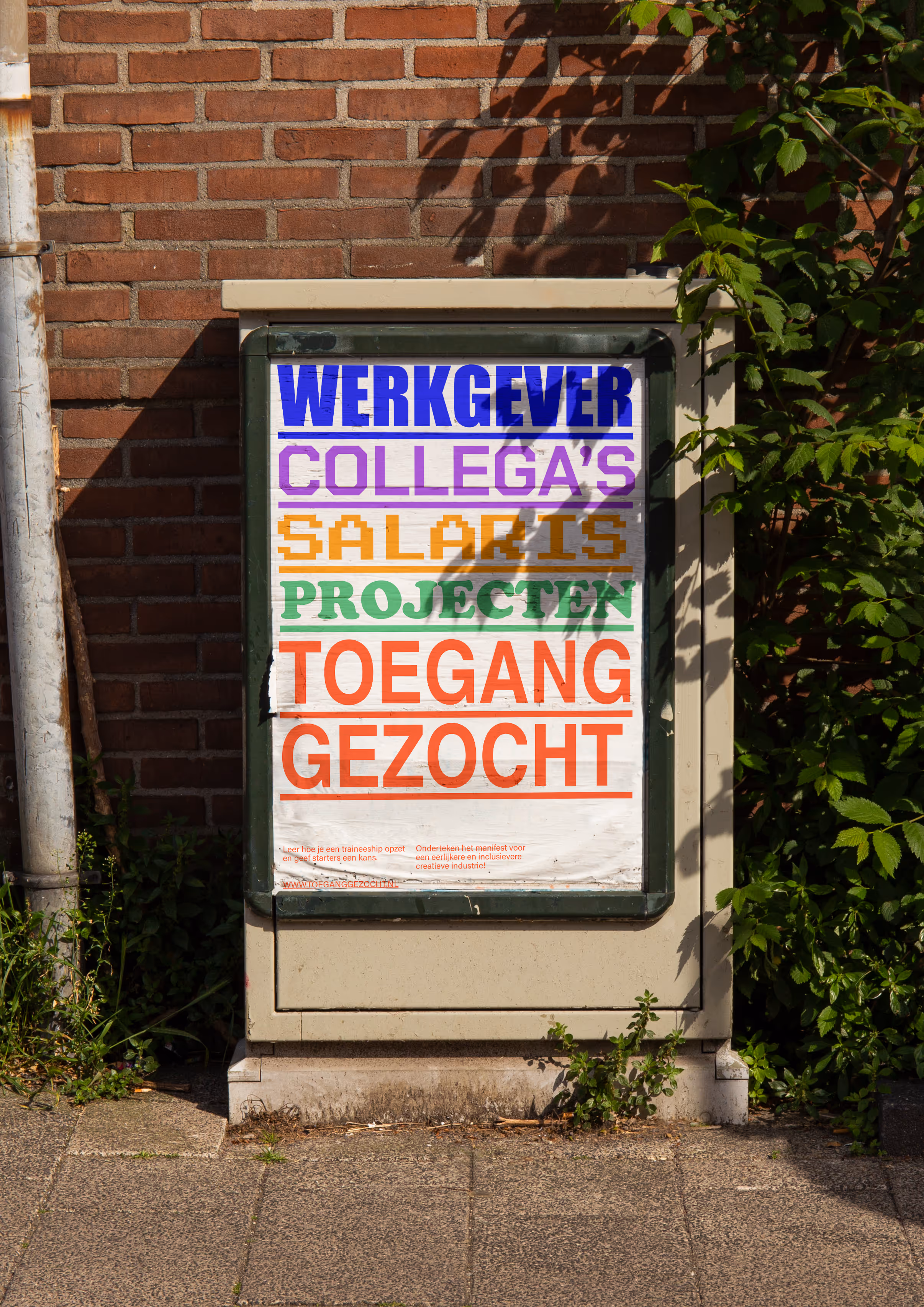
| Toegang Gezocht | Vandejong | research, graphic design | 2022 |
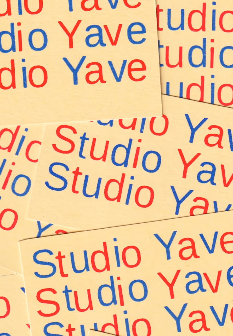
| Studio Yave | Yasmin Veenman | graphic design | 2020 |